Page loading




Flyer
-

 Authors
-
Chronological
- • 1977 (1-12)
- • 1978 (13-23)
- • 1979 (24-27)
- • 1980 (28-39)
- • 1981 (40-52)
- • 1982 (53-64)
- • 1983 (65-74)
- • 1984 (75-97)
- • 1985 (98-114)
- • 1986 (115-120)
- • 1987 (121-127)
- • 1988 (128-134)
- • 1989 (-)
- • 1990 (135)
- • 1991 (136-138)
- • 1992 (139-144)
- • 1993 (145-153)
- • 1994 (154-163)
- • 1995 (164-172)
- • 1996 (173-188)
- • 1997 (189-194)
- • 1998 (195-196)
- • 1999 (197-201)
- • 2000 (202-206)
- • 2001 (207-213)
- • 2002 (214-220)
- • 2003 (221-224)
- • 2004 (225-226)
- • 2005 (227-229)
- • 2006 (230-231)
- • 2007 (232-237)
- • 2008 (238)
- • 2009 (239-247)
- • 2010 (248)
- • 2011 (249-251)
- • 2012 (252-255)
- • 2013 (256)
- • 2014 (257)
- • 2015 (-)
- • 2016 (258-260)
- • 2017 (261-263)
- • 2018 (264-269)
- • 2019 (270-273)
- • 2019 (274-276)
- • 2021 (277)
- • 2022 (278-281)
- • 2023 (282-284)
- • 2024 (285-285b)
- • 2025 (286-288)
- • 2026 (289)
-
Des barbares...
-
Biblioteratology
- • 01. Chez les brocheurs [1]
- • 02. Chez les éditeurs[1]
- • 03. Chez les relieurs [1]
- • 04. Chez les relieurs [2]
- • 05. Chez les éditeurs [2]
- • 06. At the readers [1]
- • 07. Chez les éditeurs [3]
- • 08. Chez les éditeurs [4]
- • 09. Chez les éditeurs [5]
- • 10. Chez les relieurs [3]
- • 11. At the bookstores [1]
- • 12. Among layout designers [1]
-
Entertainments
-
Fin-de-Siècle
-
Fourneau and Fornax
-
Printings
-
Typography


Fornax is an independent, artisan publishing house based in Champagne,
in the tiny village of Bannes.
For twenty-six years, it also maintained a workshop in the Île-de-France region,
in the not-so-tiny village of Paris. It no longer does.


Workshop in Bannes.

Pink Hair
At the moment, I am sorting through my archives, trying to reorganise the stock of books from Le Fourneau (yes, I still have some!) and Fornax, and opening boxes that have not seen the light of day for donkey's years — perhaps even for several millennia. At the bottom of one such box, whose contents I had quite forgotten, I came across a printed sheet that brought back a few memories… memories dating from precisely the same period as the one that was the subject of my second remembrance (see →here).
It is 1973. I am a student at the école Estienne and, like all the other Estienne students at this distinguished school, which in those days still taught every trade associated with the art of the book, I am required to undertake a work placement. Naturally, it has to be with a company connected with the subjects I am studying. An education, I should add in passing, that I am absorbing with all the relish of an inveterate gourmand tucking into a rum baba (his favourite cake), the syrup running from the corners of his mouth.
However, true to the spirit of contradiction that has been developing in me since earliest childhood, I decide to choose a company that does not exactly conform to the school's orthodoxies: a screen-printing business, employing a technique that was not particularly held in high regard at the school at the time (see, once again, my second remembrance). And so off I go to do my placement at Trapinex, in Saulx-les-Chartreux, despite the disapproving pursing of lips at my revered school.
At Trapinex, I am welcomed with enthusiasm and respect. Just imagine! An Estienne student! One of those trained at the school that produces the cream of the profession (that, at any rate, was how the school presented itself to us, and presented us to the profession). The manager gives me permission to visit the various departments and make use of their facilities to produce a small document to accompany my work-placement report. I have an idea for this little document: a miniature book. The Trophée corrosif (second remembrance) has only recently been completed, and I conceive this little book along much the same lines, at least as far as the setting of the text is concerned: brush calligraphy. The writing, design and calligraphic execution of the layout are all done at home, away from Trapinex. I show the manager what I have in mind, he gives me the go-ahead, and I head for the photographic department to make the litho films that will be used to expose the screens. I am not one to cut corners: for my little 1/16th-format book, eight-up on each printing sheet, with a work-and-turn imposition (the same image being printed on both the front and back), which means that only one screen is needed for each colour. The miniature book is in two colours, so two screens in all.
Once I have imposed my two films, I make my way to the screen-making department. The exposure station is manned by a delightful lady of Portuguese origin, with an accent every bit as delightful, who explains how to prepare the light-sensitive coating by mixing the colloid with its sensitiser, potassium bichromate. I already know all this, of course, but I let her carry on, because she takes such pleasure in explaining her work. One should never deprive anyone of the pleasure of doing something they enjoy, or of taking pride in their work. She does not pronounce bichromate but micromate, which makes me smile inwardly. But never, absolutely never, does that smile make its way to my lips. I remain perfectly serious as I listen. My inward smile is one of affection, not amusement at her expense. We make the two screens. Or rather, she exposes and washes them out, while I watch.
Once the screens are dry, it is time to print. I have been granted permission to run the job on a small semi-automatic press. With this type of machine, while it is running, you have to keep your foot on a pedal to hold the screen in its raised position, allowing you to make the initial adjustments and then position the sheets to be printed. The moment you take your foot off the pedal, the screen comes down automatically, and the operator can print the sheet. I make my adjustments. Once everything is set, I spread the ink across the screen. It is a delicate orangey pink, specially mixed for me by one of the printers at Trapinex, to match the gouache colour sample I had given him. One sheet, two sheets, three sheets… everything is going swimmingly. I am getting the hang of the machine. Until the moment when I think I detect a faulty impression… some areas missing… probably because I have not applied enough pressure with the squeegee… I put my head underneath the screen to inspect the sheet… my foot slips off the pedal… the screen comes down, bursts over my head… and I find myself with pink hair!
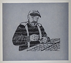
At this point, I shall pause the story to show what I generally looked like in those days, which was rather different from my present appearance.

Photo of cls at Estienne, 1973.
The photograph was taken by a classmate in one of the classrooms at Estienne, during a break between lessons. I had a beard and long hair, flared trousers, and wore jumpers all year round (lighter ones in summer, thicker ones in winter). Yes, I was smoking. Yes, in those days you were allowed to smoke at school, even in the classroom (though not during lessons). The original silver-gelatin print, measuring 30 × 40 cm, is the only photograph I have from my Estienne days. It is, unfortunately, in a rather sorry state. Slightly blurred, with a dirty negative and negative carrier during enlargement, and a print with rather too much contrast. I had to do quite a bit of work on the scan to make the photograph presentable. End of interlude.
With my foot back on the pedal, I manage to raise the damaged screen. I switch off the machine and find myself standing there like a complete idiot, thoroughly ashamed and confused, like the raven in the fable, head thrust forward and bowed down to avoid getting ink on my clothes, while drops of ink fall from my hair. Hilarity throughout the workshop, naturally.
— Well, aren't those Estienne students a clever lot!
— Is that how they teach you to print at Estienne? With your head‽…
The kind lady from the screen-making department comes to my rescue, armed with a can of solvent and some white rags, to de-pink my head, while the others carry on laughing as much as they possibly can. The workshop manager arrives, drawn by the commotion, surveys the damage with an amused smile and lets me know that he would like to see me as soon as I have finished cleaning myself up. In private, he tells me that the accident does not mean the end of my miniature book project, but that he thinks it would be preferable for one of his own printers to finish the print run. I am welcome to stay and watch him at work for as long as I like.
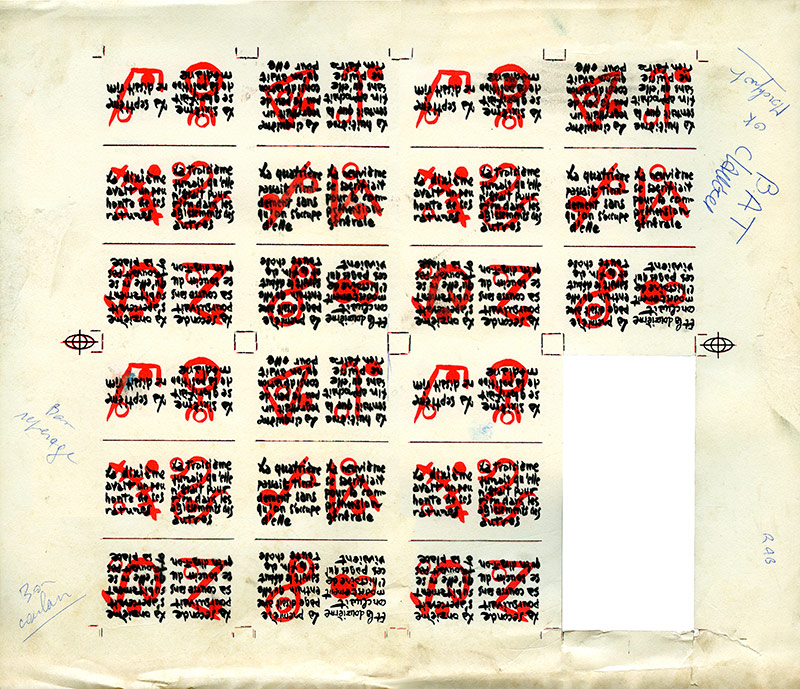
The miniature book's printer's proof (BAT)
Now that the laughter has subsided, the Trapinex staff begin to play along with me. I am no longer quite so much the hopeless Estienne trainee. Since I am no longer doing the printing myself, I am treated more or less like a customer. The printer checks that the pink ink matches my gouache sample. He checks the alignment of the two colours, as well as the register. And then he asks me to sign a printer's proof — a bon à tirer, or BAT, as we call it in French. It is this very sheet that I have just rediscovered at the bottom of a box of forgotten things. To make sure I had not made a mistake in imposing the miniature book, I had cut out one of the eight-up copies and folded it into a little book.
The rest of the placement passes without further incident, and I diligently record all my observations for my work-placement report. A report that I was supposed to defend orally at my final examination. In the end, I was spared that ordeal, having passed the written examination, which exempted me from all the oral exams. As I was the only person in my year not to have to sit this oral examination, I was obliged to convince myself that I must therefore have been top of the class. This did nothing for my vanity, but it did relieve me of a certain burden. I had not exactly prepared all the subjects for the oral examination thoroughly…
I was, however, left with the hundred sheets of two-colour printing from Trapinex that I had taken away with me at the end of my placement, together with a film for exposing the screen for the book's cover. And also the remainder of the pot of pink ink specially mixed for me. I printed the cover in my own screen-printing workshop, without putting my head through the screen this time.
The sheets from Trapinex would have allowed me to make 800 miniature books. I made quite a number of them. Fifty-three years later, I still have some left to produce. I make them to order only.
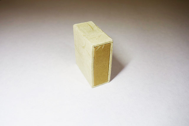
The box, wrapper and slipcase that I made at the time to hold four copies (the four different cover colours) of the Douze pages miniature book.
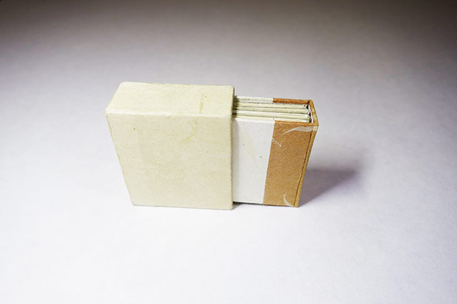
The box, slightly open.
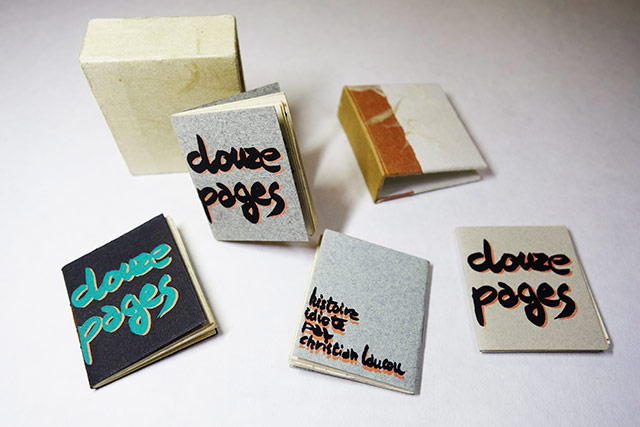
The four cover versions. The Douze pages (stupid story by Christian Laucou) miniature book measures 3.5 cm high by 3 cm wide.
Pink Hair
At the moment, I am sorting through my archives, trying to reorganise the stock of books from Le Fourneau (yes, I still have some!) and Fornax, and opening boxes that have not seen the light of day for donkey's years — perhaps even for several millennia. At the bottom of one such box, whose contents I had quite forgotten, I came across a printed sheet that brought back a few memories… memories dating from precisely the same period as the one that was the subject of my second remembrance (see →here).
It is 1973. I am a student at the école Estienne and, like all the other Estienne students at this distinguished school, which in those days still taught every trade associated with the art of the book, I am required to undertake a work placement. Naturally, it has to be with a company connected with the subjects I am studying. An education, I should add in passing, that I am absorbing with all the relish of an inveterate gourmand tucking into a rum baba (his favourite cake), the syrup running from the corners of his mouth.
However, true to the spirit of contradiction that has been developing in me since earliest childhood, I decide to choose a company that does not exactly conform to the school's orthodoxies: a screen-printing business, employing a technique that was not particularly held in high regard at the school at the time (see, once again, my second remembrance). And so off I go to do my placement at Trapinex, in Saulx-les-Chartreux, despite the disapproving pursing of lips at my revered school.
At Trapinex, I am welcomed with enthusiasm and respect. Just imagine! An Estienne student! One of those trained at the school that produces the cream of the profession (that, at any rate, was how the school presented itself to us, and presented us to the profession). The manager gives me permission to visit the various departments and make use of their facilities to produce a small document to accompany my work-placement report. I have an idea for this little document: a miniature book. The Trophée corrosif (second remembrance) has only recently been completed, and I conceive this little book along much the same lines, at least as far as the setting of the text is concerned: brush calligraphy. The writing, design and calligraphic execution of the layout are all done at home, away from Trapinex. I show the manager what I have in mind, he gives me the go-ahead, and I head for the photographic department to make the litho films that will be used to expose the screens. I am not one to cut corners: for my little 1/16th-format book, eight-up on each printing sheet, with a work-and-turn imposition (the same image being printed on both the front and back), which means that only one screen is needed for each colour. The miniature book is in two colours, so two screens in all.
Once I have imposed my two films, I make my way to the screen-making department. The exposure station is manned by a delightful lady of Portuguese origin, with an accent every bit as delightful, who explains how to prepare the light-sensitive coating by mixing the colloid with its sensitiser, potassium bichromate. I already know all this, of course, but I let her carry on, because she takes such pleasure in explaining her work. One should never deprive anyone of the pleasure of doing something they enjoy, or of taking pride in their work. She does not pronounce bichromate but micromate, which makes me smile inwardly. But never, absolutely never, does that smile make its way to my lips. I remain perfectly serious as I listen. My inward smile is one of affection, not amusement at her expense. We make the two screens. Or rather, she exposes and washes them out, while I watch.
Once the screens are dry, it is time to print. I have been granted permission to run the job on a small semi-automatic press. With this type of machine, while it is running, you have to keep your foot on a pedal to hold the screen in its raised position, allowing you to make the initial adjustments and then position the sheets to be printed. The moment you take your foot off the pedal, the screen comes down automatically, and the operator can print the sheet. I make my adjustments. Once everything is set, I spread the ink across the screen. It is a delicate orangey pink, specially mixed for me by one of the printers at Trapinex, to match the gouache colour sample I had given him. One sheet, two sheets, three sheets… everything is going swimmingly. I am getting the hang of the machine. Until the moment when I think I detect a faulty impression… some areas missing… probably because I have not applied enough pressure with the squeegee… I put my head underneath the screen to inspect the sheet… my foot slips off the pedal… the screen comes down, bursts over my head… and I find myself with pink hair!
At this point, I shall pause the story to show what I generally looked like in those days, which was rather different from my present appearance.
Photo of cls at Estienne, 1973.
The photograph was taken by a classmate in one of the classrooms at Estienne, during a break between lessons. I had a beard and long hair, flared trousers, and wore jumpers all year round (lighter ones in summer, thicker ones in winter). Yes, I was smoking. Yes, in those days you were allowed to smoke at school, even in the classroom (though not during lessons). The original silver-gelatin print, measuring 30 × 40 cm, is the only photograph I have from my Estienne days. It is, unfortunately, in a rather sorry state. Slightly blurred, with a dirty negative and negative carrier during enlargement, and a print with rather too much contrast. I had to do quite a bit of work on the scan to make the photograph presentable. End of interlude.
With my foot back on the pedal, I manage to raise the damaged screen. I switch off the machine and find myself standing there like a complete idiot, thoroughly ashamed and confused, like the raven in the fable, head thrust forward and bowed down to avoid getting ink on my clothes, while drops of ink fall from my hair. Hilarity throughout the workshop, naturally.
— Well, aren't those Estienne students a clever lot!
— Is that how they teach you to print at Estienne? With your head‽…
The kind lady from the screen-making department comes to my rescue, armed with a can of solvent and some white rags, to de-pink my head, while the others carry on laughing as much as they possibly can. The workshop manager arrives, drawn by the commotion, surveys the damage with an amused smile and lets me know that he would like to see me as soon as I have finished cleaning myself up. In private, he tells me that the accident does not mean the end of my miniature book project, but that he thinks it would be preferable for one of his own printers to finish the print run. I am welcome to stay and watch him at work for as long as I like.
The miniature book's printer's proof (BAT)
Now that the laughter has subsided, the Trapinex staff begin to play along with me. I am no longer quite so much the hopeless Estienne trainee. Since I am no longer doing the printing myself, I am treated more or less like a customer. The printer checks that the pink ink matches my gouache sample. He checks the alignment of the two colours, as well as the register. And then he asks me to sign a printer's proof — a bon à tirer, or BAT, as we call it in French. It is this very sheet that I have just rediscovered at the bottom of a box of forgotten things. To make sure I had not made a mistake in imposing the miniature book, I had cut out one of the eight-up copies and folded it into a little book.
The rest of the placement passes without further incident, and I diligently record all my observations for my work-placement report. A report that I was supposed to defend orally at my final examination. In the end, I was spared that ordeal, having passed the written examination, which exempted me from all the oral exams. As I was the only person in my year not to have to sit this oral examination, I was obliged to convince myself that I must therefore have been top of the class. This did nothing for my vanity, but it did relieve me of a certain burden. I had not exactly prepared all the subjects for the oral examination thoroughly…
I was, however, left with the hundred sheets of two-colour printing from Trapinex that I had taken away with me at the end of my placement, together with a film for exposing the screen for the book's cover. And also the remainder of the pot of pink ink specially mixed for me. I printed the cover in my own screen-printing workshop, without putting my head through the screen this time.
The sheets from Trapinex would have allowed me to make 800 miniature books. I made quite a number of them. Fifty-three years later, I still have some left to produce. I make them to order only.
The box, wrapper and slipcase that I made at the time to hold four copies (the four different cover colours) of the Douze pages miniature book.
The box, slightly open.
The four cover versions. The Douze pages (stupid story by Christian Laucou) miniature book measures 3.5 cm high by 3 cm wide.
I have recently made the decision to don a pair of arc-welding gloves whenever I venture out to my mailbox. So many things have been arriving there, almost daily of late, that its metal door and sides are beginning to heat up from the repeated opening and closing. I am afraid I might burn myself.
As recently as last Saturday, two books were waiting for me. One was expected, since I had ordered it from an antiquarian bookseller; the other came as something of a half-surprise. Its author had told me that publication was imminent, but I had no idea when it would actually appear. Books are rather like babies: their gestation is a lengthy affair, and they may arrive on schedule, prematurely, or even post-term. One never quite knows in advance. Especially when one happens to be on the receiving end of the phenomenon, that is, on the reader's side of things.
(Vinçard Strikes Again!)
Two weeks ago, I gave you a fairly exhaustive account of the arrival in my technical library of the 1823 edition of Vinçard's L'Art du typographe (see →here). The success of this unexpected acquisition gave me the itch to rummage once more through the online catalogues of antiquarian booksellers, in search of the 1806 edition (a little masterpiece) of his manual… No 1806 edition, alas. But… but… (I shall keep you in suspense a little longer) I did find his Traité de ponctuation, published in 1809. According to the Estienne copy, which happens to be the second edition, this manual went through three editions. And according to Alkan the Elder, this treatise on punctuation enjoyed a fair amount of success. (If you still haven't bought the nineteenth-century volume of Histoire de l'écriture typographique (the History of Typographic Writing) — through a complete failure of judgment or a positively breathtaking lack of interest — click →here to put matters right and redeem yourself.) In the Estienne copy of the Traité (second edition), the title page of the third edition has been pasted in immediately before the title page of the second. Proof, if proof were needed, that the third edition did indeed exist.
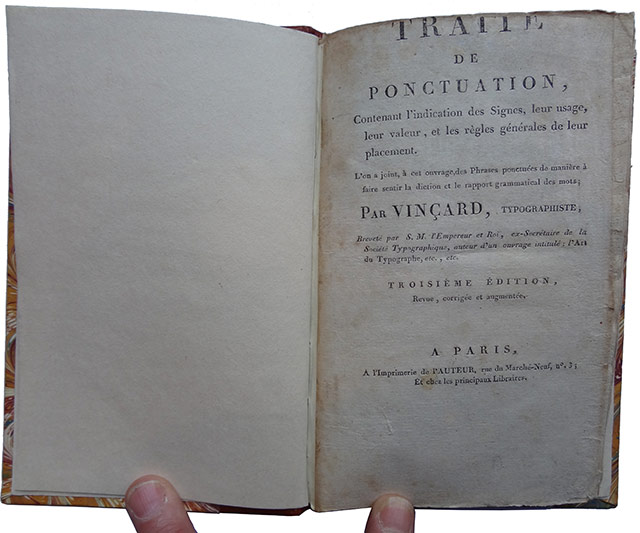
Title page of the 3rd edition .
Estienne copy: the title page of the third edition pasted in before the title page of the second edition. Without wishing to offend bookbinders as a profession (my wife would demand an immediate divorce), I must say that the person responsible for binding this particular copy was a veritable vandal. He did not hesitate to trim off the very first word of the title, despite the fact that there was ample blank paper at the bottom of the page to spare him from committing such sacrilege.
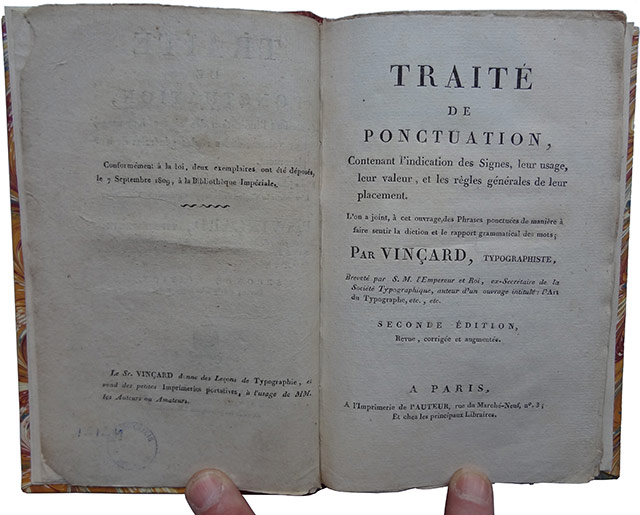
Title page of the 2nd edition .
Like the third edition, the second bears no date. The first edition is dated 1809, as we shall see shortly. Two years later, in 1811, Vinçard was stripped of his printer's licence on account of the numerus clausus. No more than eighty licensed printers were permitted to operate in Paris. Although he fought hard to retain his licence, he never got it back and was consequently unable to continue practising his trade. Perhaps this explains why the second and third editions of his treatise bear no date. It is conceivable that he defied the prohibition and printed these new editions clandestinely sometime after 1811. This would also explain why the second edition of his Art du typographe, in 1823, was set and printed by his son, who was working for a duly licensed printer.
On the page opposite this title page, on the left, we find an interesting little notice (I am preserving the rather extravagant capitalization of the original):
« Le Sr VINÇARD donne des Leçons de Typographie, et vend des petites imprimeries portatives, à l'usage de MM. les Auteurs ou Amateurs. »
In other words:
"Mr. VINÇARD gives lessons in typography and sells small portable printing presses for the use of Gentlemen Authors and Amateurs."
This might well lend support to my earlier hypothesis. Having lost his printer's licence, and with it the printing establishment that had provided his livelihood, he had to find alternative sources of income.
And now, to our recent acquisition: the first edition of the Traité de ponctuation. In other words, the original edition of the work, which one may also call, if one wishes to sound frightfully grand, the editio princeps. I was not a little pleased with myself when I discovered that what I actually had in my hands was indeed this first edition. Until now, the only copy I had known was the Estienne one, which I had photographed in order to read it.
The binding is very similar to that of my copy of the Art du typographe: marbled calfskin, with a decorative roll-tooled border. Indeed, when I placed the two books side by side, they did not take an instant dislike to one another. Quite the contrary: they adopted each other on the spot.
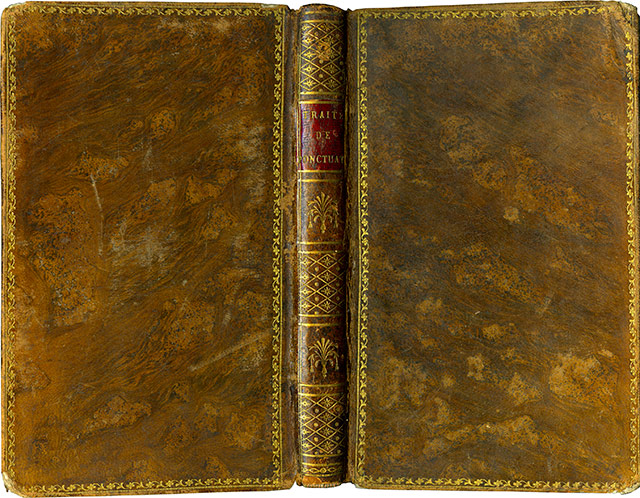
Binding of my copy .
The leather is rubbed through in places, and the corners are worn. These two characteristics, which might seem incompatible with admission to the library of a dyed-in-the-wool bibliophile, particularly one with a touch of obsessive fussiness (I am understating my case here, so as not to upset anyone), make this copy especially dear to me. They are proof that the book has served a purpose, that it has been read, handled, used — who knows? — by one or several people, to the great enrichment of their minds and the delight of their intellectual lives. This is an honest-to-goodness copy. Not some moribund creature that must on no account be touched because it happens to have an expensive binding by a celebrated bookbinder, the sort of binding that ought to be kept in the dark, at the bottom of a bank vault, lest the book (whose actual text is of little or no concern to its owner) lose a penny of its resale value.
But I digress. Here is the title page:
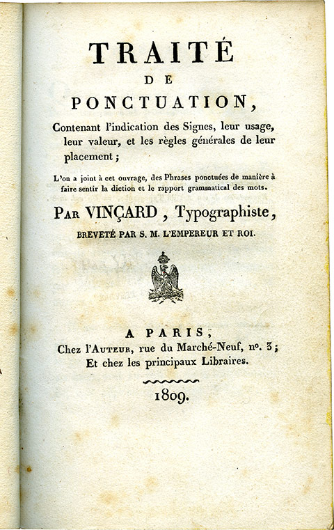
Title page.
As you can see, it is dated. Vinçard is identified as both author and printer. He describes himself as a « Typographiste ». The word is still in use today, although its meaning has changed completely. Vinçard called himself a Typographe when he was practising his trade as a printer, and a Typographiste when writing about typography. At the moment I am writing these lines, I am a typographist; when I am in my workshop, getting the tips of my fingers dirty with the toxic alloy that has served to multiply so many masterpieces, I am a typographer. That alloy, of course, is typographic metal, composed of lead, antimony, and tin.
It is this first edition of the Traité de ponctuation that allows us to understand the success of his Art du typographe. At the end of that book, Vinçard reproduces letters from several prominent personalities of the day, to whom he had sent out a substantial number of complimentary copies — free of charge, naturally. These distinguished gentlemen thanked him, and he duly published their letters of thanks. Thus, his book owed its success to a large-scale distribution campaign directed at people in influential positions. According to Alkan the Elder, some 6,000 copies were sold. This was a stroke of luck that had eluded Momoro a few years earlier. Momoro had written and printed his own manual shortly before being guillotined, which did not leave him a great deal of time for publicity and promotion.
Vinçard was, of course, by no means the first person to take an interest in French punctuation. He had numerous predecessors. To mention just one, and a particularly distinguished one at that, there was Estienne Dolet, who published in Lyon in 1540 his La manière de bien traduire d'une langue en aultre. D'advantage. De la punctuation de la langue françoyse, plus des accents d'ycelle. Vinçard's manual, however, is relatively short (168 pages), straightforward, and positively brimming with examples. The typography is clear, despite the decision to use a smaller type size for the longer examples and for poetry, so as to avoid the mortal sin of breaking a verse line in two.
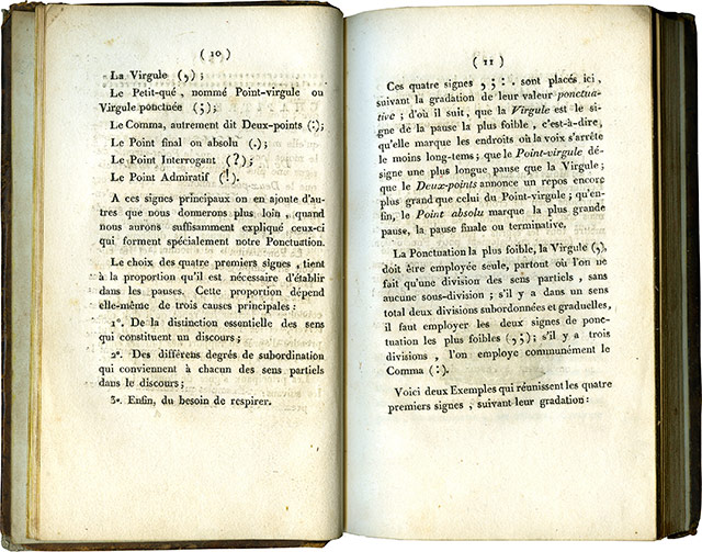
Pages 10 and 11.
One may note that in 1809 the comma was still being spaced on both sides, a practice that has long since disappeared from modern French typographic and orthotypographic usage.
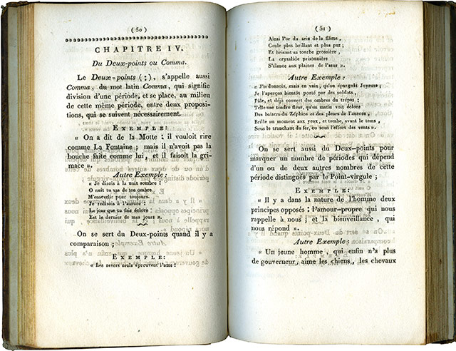
Pages 50 and 51.
Vinçard must have been in something of a hurry to get his treatise onto the market in this first, 1809 edition. He apparently handed the printed sheets over to the bookbinder a little too soon. The ink had not quite dried. This is borne out by the ink offsets visible here: the ink from the left-hand page has transferred to the right-hand page, and that from the right-hand page to the left. Since Vinçard was a competent printer, it is difficult to imagine any other explanation for this transfer than that the sheets were bound before the ink had properly dried. The only alternative would be a poorly manufactured ink with an unusually slow drying time, an explanation that seems rather less likely.
And so much for Vinçard for the time being. But, encouraged by the success of my two previous searches, I intend to keep hunting for the 1806 edition of the Art du typographe. Let us now turn to a completely different subject, one that also arrived by way of my mailbox.
(Parisian Publishers of the Prewar Era)
1870-1914
If Vinçard's book was on the slender side, my friend Gilles Picq's volume is a substantial and imposing beast. Of generous dimensions (23 cm high by 14 cm wide), it contains no fewer than 621 pages, including the table of contents. What is it about? Quite simply, it is a comprehensive survey of the publishers of what might be called the prewar era — the period I refer to as the years between the wars: the war of 1870, in which the French took a sound thrashing, and the one that began in 1914, which was considerably more murderous and ended in a French victory that brought about the Second World War. Needs must! Every so often, we bipeds of all nations are obliged to invent such historical periods in order to thin out the world's various populations and avoid the scourges of overpopulation and housing shortages. But enough of these demographic musings. Back to our Parisian publishers. One cannot help noticing, incidentally, that publishers from the suburbs and the provinces are missed out, unless our friend Gilles has a second volume planned for them. That would be an excellent idea. I must remember to ask him.
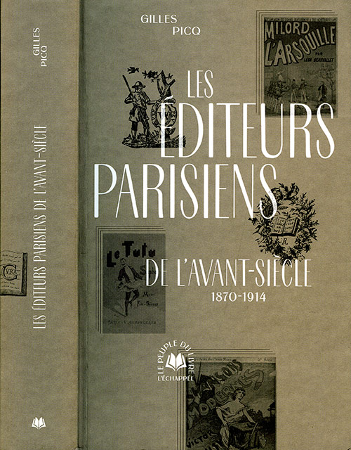
Cover (and spine, to show its thickness) of the book by Gilles Picq.
Gilles has catalogued the publishers — even those who brought out naughty books, and I mention this purely to whet the prospective reader's appetite and compel him to buy — and provides an account of each one's history, from birth to death, where death has occurred, along with their respective catalogues. The catalogues are not always exhaustive, of course. When a publisher has produced several thousand books, it is perfectly understandable that not every single title can be listed. There are only so many pages to go around. This is a Herculean undertaking he has offered us. A work requiring countless operations, endless consultations of databases, not to mention painstaking verification and the elimination of errors. A madman's task, one might say. But Gilles Picq is not mad. He is patient, tenacious, and courageous. And generous, too, since he offers us this magnum opus for a modest sum. I did the arithmetic: less than €0.047 per page. Now that's a refreshing change from the price of fuel. And since we're on the subject, his book is a wonderful fuel for the mind. It sets our little grey cells working overtime, as Hercule Poirot would say, and teaches us a veritable multitude of things.
Of course, some of you will tell me that one must either be interested in Parisian publishers of the prewar era (as I happen to be), or at least possess a desire to become interested in them, to venture into this terra incognita and clear a little intellectual undergrowth in the convolutions of one's brain, making room for some new inhabitants: the publishers just mentioned.
This is not a novel to be read from beginning to end. That would be rather silly. It is a book of the codex variety, more precisely a dictionary or something very much like one. A book to dip into on long winter evenings, when the irresistible craving for universal knowledge seizes you by the entrails and refuses to let go. Best enjoyed by a wood fire, ensconced in a comfortable armchair, if you are among the fortunate; or beside a central-heating radiator, perched on a rickety stool, if fortune has been less kind.
When I collected the book, I nearly toppled forward under its weight. The weight of accumulated knowledge, naturally. I gave it a quick browse and, as was only to be expected, immediately turned to one or two subjects I had done a little work on back when I still had hair, and when that hair was black. The Mercure de France, for instance. And so I thought I might do a little illustrating of our friend Gilles's work. His publisher, L'Échappée, did not have the financial resources to offer him a book in which all the illustrations would be reproduced in color. I know how expensive that can be, being something of an insider myself. So, with my modest means and my modest library, I shall attempt to add a little color to his entry on the Mercure de France. Here we go…
In their early days, the publishers of the Mercure de France allowed themselves a certain number of editorial eccentricities, which they gradually abandoned over the years in favor of their ever-present yellow cover, adorned with a caduceus and wrapped around the familiar in-18 format. Here are two or three examples of those early flights of fancy.
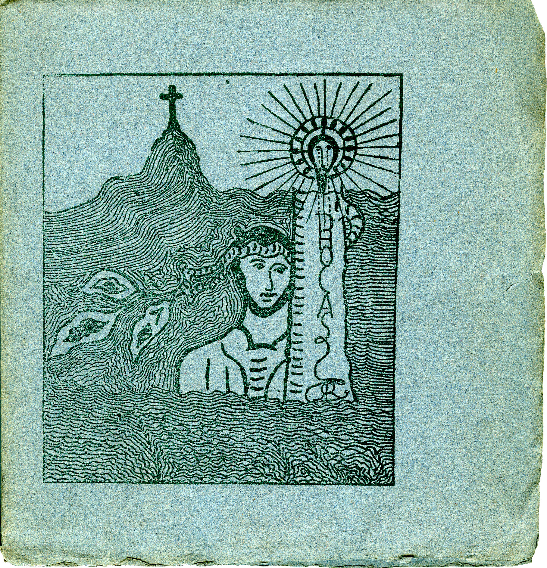
Phocas, the cover.
The front cover of Phocas by Remy de Gourmont. The book is a slim little pamphlet of 32 pages, in a square format measuring just under 16 cm. The cover drawings and vignettes were done by Gourmont himself. The title of the book does not immediately meet the eye, being cunningly concealed within the illustration.
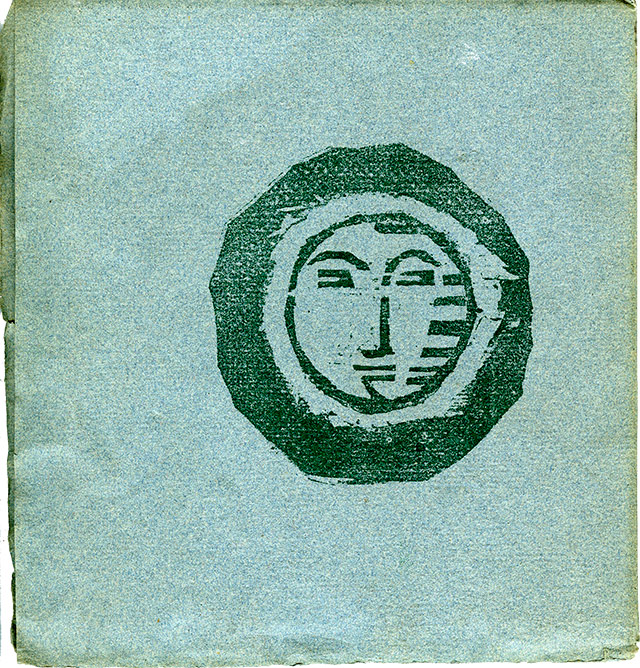
Phocas, back cover.
The drawing on the back cover. The fairly thin cover stock is dark blue Ingres MBM paper, which projects quite generously beyond the text block, with no turn-ins.
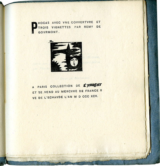
Phocas, title page.
The title page, dated 1895, bears a vignette by Gourmont and identifies the booklet as belonging to the L'Ymagier series, a periodical founded by Gourmont and Jarry that lasted only until the two men fell out over the affair of the Old Lady (Berthe de Courrière).
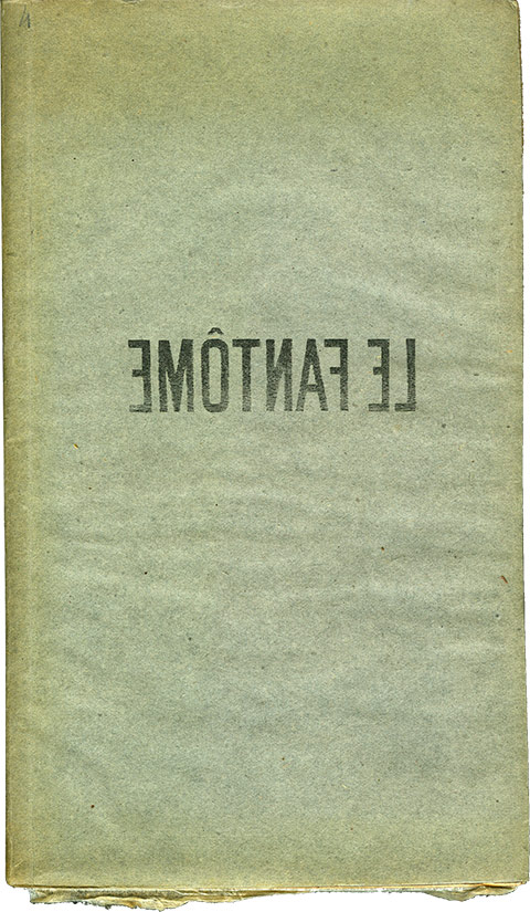
Le Fantôme, cover.
Le Fantôme, by the same Remy de Gourmont, appeared two years earlier, in 1893. It is in a rather oblong format (approximately 22 cm high by 13 cm wide), with a substantial grey cover on the outside and golden-brown, almost metallic reflections on the inside. Let there be no misunderstanding: the reproduction of this cover has not been accidentally reversed by the typographer CLS as a little joke, or simply for his own amusement. The title really is printed like a typographic composition.
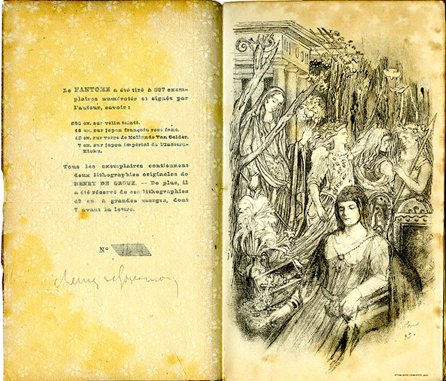
Le Fantôme, Henry de Groux lithograph.
The book contains two lithographs by Henry de Groux, placed one after the other at the beginning of the volume. The first of the two is shown here, facing the printing statement. This statement, embellished with Gourmont's autograph signature, appears somewhat blurred. The reason is that it is covered by a thin protective tissue sheet, decorated with a pattern of little flowers, which separates the two pages: one printed in letterpress, the other in lithography. This is a fairly common practice in books illustrated by lithography or intaglio engraving. A very thin sheet of tissue paper (not always decorated with flowers, I hasten to add) is placed between the illustration and the text to prevent the ink from one impression, if it has not yet dried, from transferring onto the facing page. We have already seen precisely this problem with Vinçard. Once one is certain that all the impressions have dried, the protective tissue sheets may be removed and discarded. Many collectors, however, prefer to keep them, even at the risk of allowing the tissue itself to stain or yellow the paper of the edition, should it not be made from acid-free, pH-neutral stock.
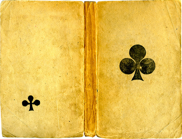
Le Trèfle noir, cover.
The unfolded cover of the small-format collection (15.5 cm high by 9.5 cm wide), Le Trèfle noir by Henri de Régnier, first edition, printed on handmade laid paper in 1895. It is a collection of three short stories (Hertulie, Histoire d'Hermagore, and Hermocrate), which earned Régnier's island in Jarry's Gestes et Opinions du docteur Faustroll, pataphysicien the name Island of Her. One can readily see that neither the author's name nor the title of the book nor the publisher's name appears on this cover. There is only a large black clover printed on the front and a smaller one on the back.
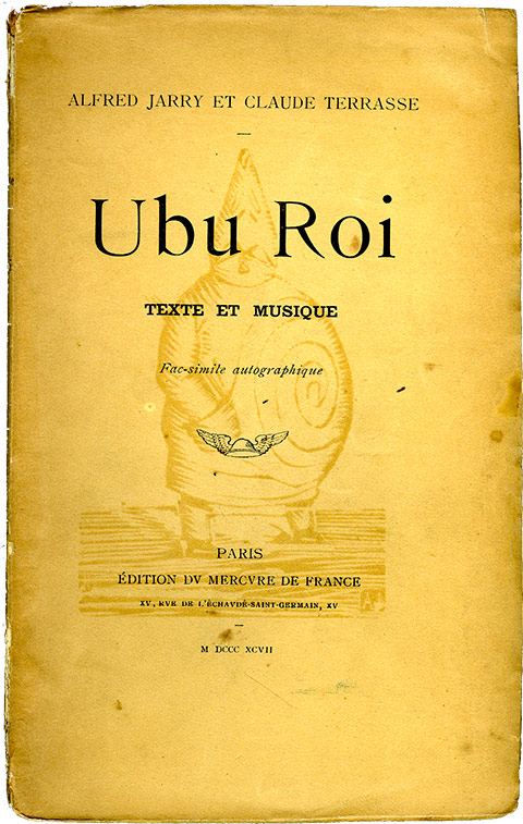
Ubu Roi, cover.
The cover of the second edition of Alfred Jarry's Ubu Roi, published in 1897. With the exception of this cover, which was printed in letterpress, the remainder of the book was printed by lithographic autography, reproducing Jarry's handwriting and that of Claude Terrasse for the musical scores. The book is in the traditional in-18 format used by the Mercure de France, but Jarry obtained permission from his friend Alfred Vallette, the publisher and director of the Mercure de France, to replace the customary caduceus with a portrait of Père Ubu, which he had engraved on wood himself. It is worth noting that the first edition of Ubu Roi, published in 1896, is entirely in letterpress, has the same small format as Le Trèfle noir, and also bears the engraved portrait of Père Ubu on its cover.
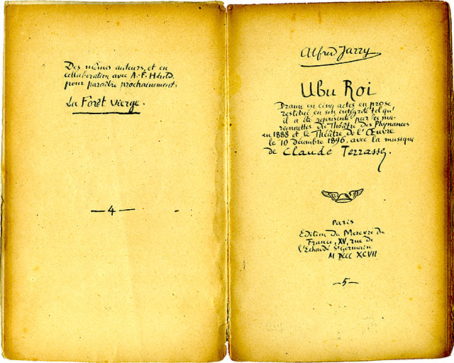
Ubu Roi, title page.
The title page of the second edition, reproduced by autography in Jarry's own hand. It should be noted that no one has ever heard tell of, read about, or actually seen any such literary Forêt vierge by Alfred Jarry and André-Ferdinand Herold, apart from the reference on page 4 of this second edition.
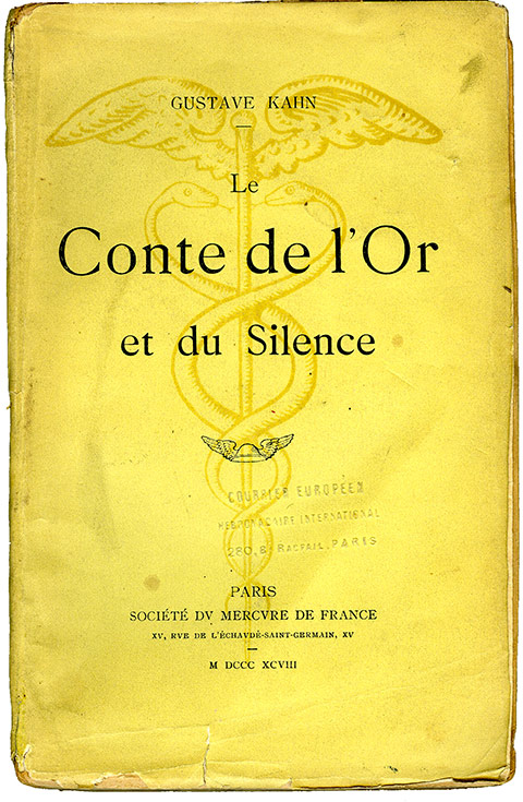
Le Conte de l'Or et du Silence, cover.
The cover of Gustave Kahn's Conte de l'Or et du Silence, first edition, published in 1898. This is the absolute standard design of the Mercure de France: yellow paper, in-18 format, a large dark-yellow caduceus, and a small black winged petasus. The design of the caduceus would change slightly over the years, but the overall aesthetic remained much the same. A few rare titles abandoned the yellow paper in favor of another color. Francis Jammes's collection of poems La Vierge et les Sonnets, for instance, appeared in dark blue in 1919. But such changes of color were exceedingly rare exceptions, worthy of a little Alfred Jarry-style Pataphysics.
My choice of this particular title by Gustave Kahn is not entirely the result of some random hand rummaging through my library. It is here to announce the publication, some time ago now, of a new edition of this novel by my very old friend Richard Shryock, the greatest specialist in Gustave Kahn in the world — and, indeed, throughout the known universe and several neighboring galaxies. This new edition, with a foreword jointly written by the masterly hands of my friend Richard and Samuel Kunkel, appeared in 2025 from Éditions du Lérot, which has long since ceased dreaming very much, and the Friends of Alfred Jarry United. It should be noted that the Conte de l'Or et du Silence is one of the twenty-seven paired books of Doctor Faustroll. Which explains the presence of Jarry and his friends.
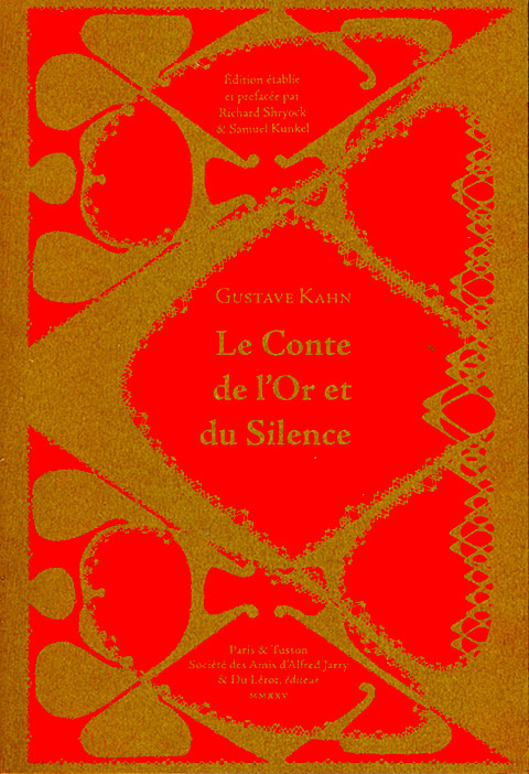
Le Conte de l'Or et du Silence, cover of the reissue .
As one can see, this resplendent cover is all blood and gold. An allusion to southwestern France, perhaps? One might well doubt it, since Gustave Kahn was born in Metz. So perhaps it is a matter of color symbolism. Gold is readily explained by the Gold in the title. But does the red symbolize Silence? Perhaps… if we remember that in heraldry the French word for red is gueules, and that the expression « Ta gueule ! » — literally something along the lines of "shut your trap!" — is an invitation to silence addressed to an interlocutor who has become altogether too talkative. Which, I fear, is precisely what I have been today. I shall therefore fall silent…
I have recently made the decision to don a pair of arc-welding gloves whenever I venture out to my mailbox. So many things have been arriving there, almost daily of late, that its metal door and sides are beginning to heat up from the repeated opening and closing. I am afraid I might burn myself.
As recently as last Saturday, two books were waiting for me. One was expected, since I had ordered it from an antiquarian bookseller; the other came as something of a half-surprise. Its author had told me that publication was imminent, but I had no idea when it would actually appear. Books are rather like babies: their gestation is a lengthy affair, and they may arrive on schedule, prematurely, or even post-term. One never quite knows in advance. Especially when one happens to be on the receiving end of the phenomenon, that is, on the reader's side of things.
(Vinçard Strikes Again!)
Two weeks ago, I gave you a fairly exhaustive account of the arrival in my technical library of the 1823 edition of Vinçard's L'Art du typographe (see →here). The success of this unexpected acquisition gave me the itch to rummage once more through the online catalogues of antiquarian booksellers, in search of the 1806 edition (a little masterpiece) of his manual… No 1806 edition, alas. But… but… (I shall keep you in suspense a little longer) I did find his Traité de ponctuation, published in 1809. According to the Estienne copy, which happens to be the second edition, this manual went through three editions. And according to Alkan the Elder, this treatise on punctuation enjoyed a fair amount of success. (If you still haven't bought the nineteenth-century volume of Histoire de l'écriture typographique (the History of Typographic Writing) — through a complete failure of judgment or a positively breathtaking lack of interest — click →here to put matters right and redeem yourself.) In the Estienne copy of the Traité (second edition), the title page of the third edition has been pasted in immediately before the title page of the second. Proof, if proof were needed, that the third edition did indeed exist.
Title page of the 3rd edition .
Estienne copy: the title page of the third edition pasted in before the title page of the second edition. Without wishing to offend bookbinders as a profession (my wife would demand an immediate divorce), I must say that the person responsible for binding this particular copy was a veritable vandal. He did not hesitate to trim off the very first word of the title, despite the fact that there was ample blank paper at the bottom of the page to spare him from committing such sacrilege.
Title page of the 2nd edition .
Like the third edition, the second bears no date. The first edition is dated 1809, as we shall see shortly. Two years later, in 1811, Vinçard was stripped of his printer's licence on account of the numerus clausus. No more than eighty licensed printers were permitted to operate in Paris. Although he fought hard to retain his licence, he never got it back and was consequently unable to continue practising his trade. Perhaps this explains why the second and third editions of his treatise bear no date. It is conceivable that he defied the prohibition and printed these new editions clandestinely sometime after 1811. This would also explain why the second edition of his Art du typographe, in 1823, was set and printed by his son, who was working for a duly licensed printer.
On the page opposite this title page, on the left, we find an interesting little notice (I am preserving the rather extravagant capitalization of the original):
« Le Sr VINÇARD donne des Leçons de Typographie, et vend des petites imprimeries portatives, à l'usage de MM. les Auteurs ou Amateurs. »
In other words:
"Mr. VINÇARD gives lessons in typography and sells small portable printing presses for the use of Gentlemen Authors and Amateurs."
This might well lend support to my earlier hypothesis. Having lost his printer's licence, and with it the printing establishment that had provided his livelihood, he had to find alternative sources of income.
And now, to our recent acquisition: the first edition of the Traité de ponctuation. In other words, the original edition of the work, which one may also call, if one wishes to sound frightfully grand, the editio princeps. I was not a little pleased with myself when I discovered that what I actually had in my hands was indeed this first edition. Until now, the only copy I had known was the Estienne one, which I had photographed in order to read it.
The binding is very similar to that of my copy of the Art du typographe: marbled calfskin, with a decorative roll-tooled border. Indeed, when I placed the two books side by side, they did not take an instant dislike to one another. Quite the contrary: they adopted each other on the spot.
Binding of my copy .
The leather is rubbed through in places, and the corners are worn. These two characteristics, which might seem incompatible with admission to the library of a dyed-in-the-wool bibliophile, particularly one with a touch of obsessive fussiness (I am understating my case here, so as not to upset anyone), make this copy especially dear to me. They are proof that the book has served a purpose, that it has been read, handled, used — who knows? — by one or several people, to the great enrichment of their minds and the delight of their intellectual lives. This is an honest-to-goodness copy. Not some moribund creature that must on no account be touched because it happens to have an expensive binding by a celebrated bookbinder, the sort of binding that ought to be kept in the dark, at the bottom of a bank vault, lest the book (whose actual text is of little or no concern to its owner) lose a penny of its resale value.
But I digress. Here is the title page:
Title page.
As you can see, it is dated. Vinçard is identified as both author and printer. He describes himself as a « Typographiste ». The word is still in use today, although its meaning has changed completely. Vinçard called himself a Typographe when he was practising his trade as a printer, and a Typographiste when writing about typography. At the moment I am writing these lines, I am a typographist; when I am in my workshop, getting the tips of my fingers dirty with the toxic alloy that has served to multiply so many masterpieces, I am a typographer. That alloy, of course, is typographic metal, composed of lead, antimony, and tin.
It is this first edition of the Traité de ponctuation that allows us to understand the success of his Art du typographe. At the end of that book, Vinçard reproduces letters from several prominent personalities of the day, to whom he had sent out a substantial number of complimentary copies — free of charge, naturally. These distinguished gentlemen thanked him, and he duly published their letters of thanks. Thus, his book owed its success to a large-scale distribution campaign directed at people in influential positions. According to Alkan the Elder, some 6,000 copies were sold. This was a stroke of luck that had eluded Momoro a few years earlier. Momoro had written and printed his own manual shortly before being guillotined, which did not leave him a great deal of time for publicity and promotion.
Vinçard was, of course, by no means the first person to take an interest in French punctuation. He had numerous predecessors. To mention just one, and a particularly distinguished one at that, there was Estienne Dolet, who published in Lyon in 1540 his La manière de bien traduire d'une langue en aultre. D'advantage. De la punctuation de la langue françoyse, plus des accents d'ycelle. Vinçard's manual, however, is relatively short (168 pages), straightforward, and positively brimming with examples. The typography is clear, despite the decision to use a smaller type size for the longer examples and for poetry, so as to avoid the mortal sin of breaking a verse line in two.
Pages 10 and 11.
One may note that in 1809 the comma was still being spaced on both sides, a practice that has long since disappeared from modern French typographic and orthotypographic usage.
Pages 50 and 51.
Vinçard must have been in something of a hurry to get his treatise onto the market in this first, 1809 edition. He apparently handed the printed sheets over to the bookbinder a little too soon. The ink had not quite dried. This is borne out by the ink offsets visible here: the ink from the left-hand page has transferred to the right-hand page, and that from the right-hand page to the left. Since Vinçard was a competent printer, it is difficult to imagine any other explanation for this transfer than that the sheets were bound before the ink had properly dried. The only alternative would be a poorly manufactured ink with an unusually slow drying time, an explanation that seems rather less likely.
And so much for Vinçard for the time being. But, encouraged by the success of my two previous searches, I intend to keep hunting for the 1806 edition of the Art du typographe. Let us now turn to a completely different subject, one that also arrived by way of my mailbox.
(Parisian Publishers of the Prewar Era)
1870-1914
If Vinçard's book was on the slender side, my friend Gilles Picq's volume is a substantial and imposing beast. Of generous dimensions (23 cm high by 14 cm wide), it contains no fewer than 621 pages, including the table of contents. What is it about? Quite simply, it is a comprehensive survey of the publishers of what might be called the prewar era — the period I refer to as the years between the wars: the war of 1870, in which the French took a sound thrashing, and the one that began in 1914, which was considerably more murderous and ended in a French victory that brought about the Second World War. Needs must! Every so often, we bipeds of all nations are obliged to invent such historical periods in order to thin out the world's various populations and avoid the scourges of overpopulation and housing shortages. But enough of these demographic musings. Back to our Parisian publishers. One cannot help noticing, incidentally, that publishers from the suburbs and the provinces are missed out, unless our friend Gilles has a second volume planned for them. That would be an excellent idea. I must remember to ask him.
Cover (and spine, to show its thickness) of the book by Gilles Picq.
Gilles has catalogued the publishers — even those who brought out naughty books, and I mention this purely to whet the prospective reader's appetite and compel him to buy — and provides an account of each one's history, from birth to death, where death has occurred, along with their respective catalogues. The catalogues are not always exhaustive, of course. When a publisher has produced several thousand books, it is perfectly understandable that not every single title can be listed. There are only so many pages to go around. This is a Herculean undertaking he has offered us. A work requiring countless operations, endless consultations of databases, not to mention painstaking verification and the elimination of errors. A madman's task, one might say. But Gilles Picq is not mad. He is patient, tenacious, and courageous. And generous, too, since he offers us this magnum opus for a modest sum. I did the arithmetic: less than €0.047 per page. Now that's a refreshing change from the price of fuel. And since we're on the subject, his book is a wonderful fuel for the mind. It sets our little grey cells working overtime, as Hercule Poirot would say, and teaches us a veritable multitude of things.
Of course, some of you will tell me that one must either be interested in Parisian publishers of the prewar era (as I happen to be), or at least possess a desire to become interested in them, to venture into this terra incognita and clear a little intellectual undergrowth in the convolutions of one's brain, making room for some new inhabitants: the publishers just mentioned.
This is not a novel to be read from beginning to end. That would be rather silly. It is a book of the codex variety, more precisely a dictionary or something very much like one. A book to dip into on long winter evenings, when the irresistible craving for universal knowledge seizes you by the entrails and refuses to let go. Best enjoyed by a wood fire, ensconced in a comfortable armchair, if you are among the fortunate; or beside a central-heating radiator, perched on a rickety stool, if fortune has been less kind.
When I collected the book, I nearly toppled forward under its weight. The weight of accumulated knowledge, naturally. I gave it a quick browse and, as was only to be expected, immediately turned to one or two subjects I had done a little work on back when I still had hair, and when that hair was black. The Mercure de France, for instance. And so I thought I might do a little illustrating of our friend Gilles's work. His publisher, L'Échappée, did not have the financial resources to offer him a book in which all the illustrations would be reproduced in color. I know how expensive that can be, being something of an insider myself. So, with my modest means and my modest library, I shall attempt to add a little color to his entry on the Mercure de France. Here we go…
In their early days, the publishers of the Mercure de France allowed themselves a certain number of editorial eccentricities, which they gradually abandoned over the years in favor of their ever-present yellow cover, adorned with a caduceus and wrapped around the familiar in-18 format. Here are two or three examples of those early flights of fancy.
Phocas, the cover.
The front cover of Phocas by Remy de Gourmont. The book is a slim little pamphlet of 32 pages, in a square format measuring just under 16 cm. The cover drawings and vignettes were done by Gourmont himself. The title of the book does not immediately meet the eye, being cunningly concealed within the illustration.
Phocas, back cover.
The drawing on the back cover. The fairly thin cover stock is dark blue Ingres MBM paper, which projects quite generously beyond the text block, with no turn-ins.
Phocas, title page.
The title page, dated 1895, bears a vignette by Gourmont and identifies the booklet as belonging to the L'Ymagier series, a periodical founded by Gourmont and Jarry that lasted only until the two men fell out over the affair of the Old Lady (Berthe de Courrière).
Le Fantôme, cover.
Le Fantôme, by the same Remy de Gourmont, appeared two years earlier, in 1893. It is in a rather oblong format (approximately 22 cm high by 13 cm wide), with a substantial grey cover on the outside and golden-brown, almost metallic reflections on the inside. Let there be no misunderstanding: the reproduction of this cover has not been accidentally reversed by the typographer CLS as a little joke, or simply for his own amusement. The title really is printed like a typographic composition.
Le Fantôme, Henry de Groux lithograph.
The book contains two lithographs by Henry de Groux, placed one after the other at the beginning of the volume. The first of the two is shown here, facing the printing statement. This statement, embellished with Gourmont's autograph signature, appears somewhat blurred. The reason is that it is covered by a thin protective tissue sheet, decorated with a pattern of little flowers, which separates the two pages: one printed in letterpress, the other in lithography. This is a fairly common practice in books illustrated by lithography or intaglio engraving. A very thin sheet of tissue paper (not always decorated with flowers, I hasten to add) is placed between the illustration and the text to prevent the ink from one impression, if it has not yet dried, from transferring onto the facing page. We have already seen precisely this problem with Vinçard. Once one is certain that all the impressions have dried, the protective tissue sheets may be removed and discarded. Many collectors, however, prefer to keep them, even at the risk of allowing the tissue itself to stain or yellow the paper of the edition, should it not be made from acid-free, pH-neutral stock.
Le Trèfle noir, cover.
The unfolded cover of the small-format collection (15.5 cm high by 9.5 cm wide), Le Trèfle noir by Henri de Régnier, first edition, printed on handmade laid paper in 1895. It is a collection of three short stories (Hertulie, Histoire d'Hermagore, and Hermocrate), which earned Régnier's island in Jarry's Gestes et Opinions du docteur Faustroll, pataphysicien the name Island of Her. One can readily see that neither the author's name nor the title of the book nor the publisher's name appears on this cover. There is only a large black clover printed on the front and a smaller one on the back.
Ubu Roi, cover.
The cover of the second edition of Alfred Jarry's Ubu Roi, published in 1897. With the exception of this cover, which was printed in letterpress, the remainder of the book was printed by lithographic autography, reproducing Jarry's handwriting and that of Claude Terrasse for the musical scores. The book is in the traditional in-18 format used by the Mercure de France, but Jarry obtained permission from his friend Alfred Vallette, the publisher and director of the Mercure de France, to replace the customary caduceus with a portrait of Père Ubu, which he had engraved on wood himself. It is worth noting that the first edition of Ubu Roi, published in 1896, is entirely in letterpress, has the same small format as Le Trèfle noir, and also bears the engraved portrait of Père Ubu on its cover.
Ubu Roi, title page.
The title page of the second edition, reproduced by autography in Jarry's own hand. It should be noted that no one has ever heard tell of, read about, or actually seen any such literary Forêt vierge by Alfred Jarry and André-Ferdinand Herold, apart from the reference on page 4 of this second edition.
Le Conte de l'Or et du Silence, cover.
The cover of Gustave Kahn's Conte de l'Or et du Silence, first edition, published in 1898. This is the absolute standard design of the Mercure de France: yellow paper, in-18 format, a large dark-yellow caduceus, and a small black winged petasus. The design of the caduceus would change slightly over the years, but the overall aesthetic remained much the same. A few rare titles abandoned the yellow paper in favor of another color. Francis Jammes's collection of poems La Vierge et les Sonnets, for instance, appeared in dark blue in 1919. But such changes of color were exceedingly rare exceptions, worthy of a little Alfred Jarry-style Pataphysics.
My choice of this particular title by Gustave Kahn is not entirely the result of some random hand rummaging through my library. It is here to announce the publication, some time ago now, of a new edition of this novel by my very old friend Richard Shryock, the greatest specialist in Gustave Kahn in the world — and, indeed, throughout the known universe and several neighboring galaxies. This new edition, with a foreword jointly written by the masterly hands of my friend Richard and Samuel Kunkel, appeared in 2025 from Éditions du Lérot, which has long since ceased dreaming very much, and the Friends of Alfred Jarry United. It should be noted that the Conte de l'Or et du Silence is one of the twenty-seven paired books of Doctor Faustroll. Which explains the presence of Jarry and his friends.
Le Conte de l'Or et du Silence, cover of the reissue .
As one can see, this resplendent cover is all blood and gold. An allusion to southwestern France, perhaps? One might well doubt it, since Gustave Kahn was born in Metz. So perhaps it is a matter of color symbolism. Gold is readily explained by the Gold in the title. But does the red symbolize Silence? Perhaps… if we remember that in heraldry the French word for red is gueules, and that the expression « Ta gueule ! » — literally something along the lines of "shut your trap!" — is an invitation to silence addressed to an interlocutor who has become altogether too talkative. Which, I fear, is precisely what I have been today. I shall therefore fall silent…

L’homme au coin

10 pages,
format 8,5 x 8,5 cm.
tirage à environ 30 exemplaires en typographie au plomb.
Thomas Braun
des fromages
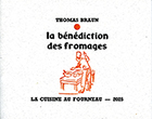
8 pages,
format 11,2 x 9 cm.
tirage à 131 exemplaires en typographie.
CLS
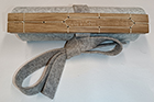
Un volumen,
79 cm de long, 17,5 cm de haut.
tirage à 10 exemplaires en linogravure.
Marie-Rose de France
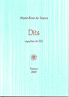
26 petits textes en proses poétique. Vignettes de CLS.
tirage à 120 exemplaires en typographie au plomb.
Marie-Rose de France
|
|
36 p., format 10 x 14 cm. composé et imprimé en typographie au plomb Tirage à 120 exemplaires. (cliquer sur l'image pour en savoir plus) |
... for those who are too lazy to seek.
14909957 visitors
315 visitors online
Fornax éditeur 18, route de Coizard, F51230 Bannes – France

