Page loading


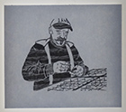
L’homme au coin

10 pages,
format 8,5 x 8,5 cm.
tirage à environ 30 exemplaires en typographie au plomb.
Thomas Braun
des fromages
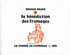
8 pages,
format 11,2 x 9 cm.
tirage à 131 exemplaires en typographie.
CLS
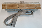
Un volumen,
79 cm de long, 17,5 cm de haut.
tirage à 10 exemplaires en linogravure.
Marie-Rose de France
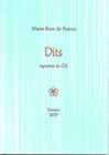
26 petits textes en proses poétique. Vignettes de CLS.
tirage à 120 exemplaires en typographie au plomb.
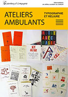
Flyer
Marie-Rose de France
|
|
36 p., format 10 x 14 cm. composé et imprimé en typographie au plomb Tirage à 120 exemplaires. (cliquer sur l'image pour en savoir plus) |
-

 Authors
 -
Chronological
- • 1977 (1-12)
- • 1978 (13-23)
- • 1979 (24-27)
- • 1980 (28-39)
- • 1981 (40-52)
- • 1982 (53-64)
- • 1983 (65-74)
- • 1984 (75-97)
- • 1985 (98-114)
- • 1986 (115-120)
- • 1987 (121-127)
- • 1988 (128-134)
- • 1989 (-)
- • 1990 (135)
- • 1991 (136-138)
- • 1992 (139-144)
- • 1993 (145-153)
- • 1994 (154-163)
- • 1995 (164-172)
- • 1996 (173-188)
- • 1997 (189-194)
- • 1998 (195-196)
- • 1999 (197-201)
- • 2000 (202-206)
- • 2001 (207-213)
- • 2002 (214-220)
- • 2003 (221-224)
- • 2004 (225-226)
- • 2005 (227-229)
- • 2006 (230-231)
- • 2007 (232-237)
- • 2008 (238)
- • 2009 (239-247)
- • 2010 (248)
- • 2011 (249-251)
- • 2012 (252-255)
- • 2013 (256)
- • 2014 (257)
- • 2015 (-)
- • 2016 (258-260)
- • 2017 (261-263)
- • 2018 (264-269)
- • 2019 (270-273)
- • 2019 (274-276)
- • 2021 (277)
- • 2022 (278-281)
- • 2023 (282-284)
- • 2024 (285-285b)
- • 2025 (286-288)
- • 2026 (289)
-
Des barbares...
... for those who are too lazy to seek.
-
Biblioteratology
- • 01. Chez les brocheurs [1]
- • 02. Chez les éditeurs[1]
- • 03. Chez les relieurs [1]
- • 04. Chez les relieurs [2]
- • 05. Chez les éditeurs [2]
- • 06. At the readers [1]
- • 07. Chez les éditeurs [3]
- • 08. Chez les éditeurs [4]
- • 09. Chez les éditeurs [5]
- • 10. Chez les relieurs [3]
- • 11. At the bookstores [1]
- • 12. Among layout designers [1]
-
Entertainments
-
Fin-de-Siècle
-
Fourneau and Fornax
-
Printings
-
Typography
14574513 visitors
92 visitors online


Memories, 2 - by cls
Those who know me vaguely, perhaps even those who think they know me rather better, or even know me well, not to mention the ordinary two-legged creatures who don't know me at all, are liable to think—when they think, that is, which not everyone does—that I am first and foremost a printer, and that, as a printer, I am nothing more than a foul-mouthed, backward-looking devotee of old-fashioned hot-metal typesetting. Or next to nothing else. If that's what you think of me, potential reader, assuming you actually exist, or young lady reader of my dreams, "ce que tu te goures, ce que tu te gourres" (Both spellings are possible in French, even though Queneau opted for the first.) Approximatively: boy (or girl), are you wrong! Wrong, wrong! Of course, there's a grain of truth in these misleading assumptions, but that's by no means the whole story.
I learned typography, because everything can be learned, even the trade of international criminal or head of state (which amounts to much the same thing). I learned it to make books, and only to make books, so that I could master every aspect of the process, from writing my own texts—or choosing someone else's—to the finished product, taking in the layout, any illustrations, the printing, and the folding of the printed sheets along the way. But before I learned that damned hot-metal typography, I had learned screen printing with some friends who, like me, had taken part in the events of May 1968. And it was by screen printing that I made my very first book.
The year was 1973. I was in my first year at Estienne, the Paris printing school, but I had already had my own screen-printing workshop for some time, a workshop I had built with my own fair hands, apart from the squeegees and the ink, which I bought from Tripette et Renaud. At Estienne in the 1970s, you simply did not talk about screen printing. Screen printing was taboo. Letterpress, offset, and rotogravure were our trinity of goddesses, to whom we were expected to give thanks at every hour of the day and night. Things have changed since then. Screen printing is now accepted there, and the religion of Estienne has become monotheistic. These days, they worship that cow, IO—or rather, 1 0—the goddess of all things digital.
So, 1973. Classes were over, summer was beginning, and with it came an overwhelming urge to make a proper book. I mentioned the idea to a friend (someone I rarely see these days), and we decided to work out the contents together. Twelve texts that might be called poems (or might not…), six by each of us. Each of us would illustrate three of our own texts and three of the other's. I would take care of the layout and the actual production, using screen printing, while my collaborator went off on holiday.
I was bursting with enthusiasm, filled with an indescribable happiness at the prospect of embarking on this adventure. It was my first real book layout, and I conceived it so that the book would be impossible to leaf through. When you hold it in your hands and try to turn the pages, all you see is blank paper. I was rather pleased with myself, I can tell you. I then hand-lettered the texts with a brush on the transparent film used to expose the screens, and turned our drawings into films for printing as well. July and a good part of August went by in the making of the book, right through to the final assembly. Sixty copies, in A4 format, five of them not for sale.
It was while making this book that I discovered the wonderful possibilities of manual screen printing. Of all printing techniques, it is the only one within the reach of ordinary mortals like us that allows white (or any other light colour) to cover black (or any other colour) without becoming dirty, remaining truly white or retaining its original hue. A quasi-mystical technique that makes immaculate conception possible, even for donkeys and great big oxen. A genuine miracle for those of sound mind!
To tell you that I am still proud of this book today would be an exaggeration. I still appreciate the practical achievement, certainly… but as for the contents… The title of the book is an exquisite corpse that my friend and I came up with together, the first and best of a little series. The cover drawing was done by Nicolas Stavropoulos, who was in charge of the visual arts workshop in Villejuif, where we attended classes in drawing—still life, the nude, clothed poses—and in lino and woodcut printing. We printed our engravings, of all things, on a lithographic press!
There is no need to be ashamed of one's early work. This book is the first tangible witness to an evolution that was my own. The same is true of anyone who ventures into creative work, unless he or she is irredeemably hopeless. So, here it is. I'm not passing judgment on it. I'm simply showing it to you.
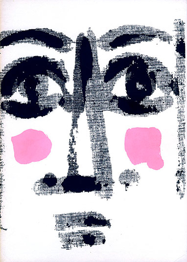
As those curious enough to leaf through the PDF I made from a copy in my personal collection will have noticed, this book contains a great many blank pages. The explanation lies in the structure of the layout. Each text is illustrated by an image, and the text and image are printed on one side only of a separate sheet. They face one another, tucked inside a four-page folder, whose first page bears the title of the text. The first six texts are by Michel Tabanou, who illustrated the first three; I illustrated the last three. The next six texts are mine: Tabanou illustrated the first three, and I illustrated the last three.
You are perfectly entitled to like it or dislike it. Make the most of that freedom, in every possible way, while you can. Before long, freedom of opinion may no longer be quite what it is today…


Nobody gave a comment yet.
Be the first to do so!
Undergrowth typography
- • Attentiveness
- • Questioning
- • Begining
Typographical practice
- • Mould
- • Letterpress for beginners
- • Blains printing museum
- • A post card
- • A post card
- • Marabouts from A to D
- • Treading
- • Visit to Bannes
- • Homework
- • Curving machine
- • Haas and Frutiger
- • K crossed out
- • Word stamp
- • Hatching
- • Gutenberg in comics [2]
- • Champagne Printing Museum
- • Stamp
- • Gutenberg in comics [1]
- • Subscribed signs
- • Typofeminism
- • Rebais house of Printing
- • Cedilla
- • Versatur
- • Ben-day
- • Letters
- • wood types
- • Tours typography museum
- • Old book
- • Types...
- • Abbreviation
- • Height to paper
- • Mystery font
- • Typographic old times
- • Cleaning up a Della Robbia case
- • Type case [2]
- • Type case [1]
- • Bijou typographique n° 2 Émile Teillac
- • Restoration of an typo case
- • To murder the typo?
- • Little brother
- • Wishes 2014
- • Mould & library
- • Wishes 2013
- • Chromotypography
- • Wishes 2012
- • Decoration
- • The tools of the workshop [9]
- • The tools of the workshop [8]
- • The tools of the workshop [7]
- • The tools of the workshop [6]
- • The tools of the workshop [5]
- • The tools of the workshop [4]
- • The tools of the workshop [3]
- • The tools of the workshop [2]
- • The tools of the workshop [1]
- • Attrape-science
- • Drawing of the letter
- • Handbook
- • Atelier de Saint-Maur
- • Au courant
- • Gutenberg
- • Format typographique
- • Summer journey
- • Apostrophe
- • Baguette
- • Saint-Jean
- • Childishnesses
- • Logo
- • New typography at Estienne school
Typo des rues
Tools
- • Table
- • Specimen
- • Roller
- • Bellows
- • Invention patent
- • Magnifying Glass
- • Autograph presses -2
- • Autograph presses -1
- • Copy press
- • cardboard shears
- • Shear
The picture of the day...
- • Fresco
- • Treasure
- • Black and white
- • Papaver
- • Little prince...
- • Vegetable garden
- • Gâteaux
- • Macrosillon
- • Mills
- • Ring
- • Noise
- • Hedgehog
- • Hell
- • Sheep
- • Writing
- • Procrastination
- • Buffalo
- • Free
- • Enameled sheet metal
- • Emergency
- • VGT
- • Advice
- • Crucifixion
- • Plane tree (bis)
- • Garbage can
- • Pencil
- • Berries
- • Foresightedness
- • Heritage (continued)
- • Heritage
- • Mona
- • Craftsmen
- • Carrot
- • Ladybug
- • Punning signs
- • Weather report
- • Velocipede
- • Mysterious shop
- • Plane tree
- • Cathedral
- • Dissent
- • Heart
- • No entry
- • A-Z
- • Glass harmonica
- • Silence
- • Decentralization
- • Things
- • Julie
- • Socks
- • Cats (continued)
- • Rebus
- • Tit
- • Cats
- • Linen
- • Love story
- • Bowltree
- • Man
- • Athée (atheist)
- • Supposition
- • Cocktail
- • Arago
- • Hopscotch
- • Watchdog
- • Road safety
- • Queue
- • Tradition
- • Freedom
- • Curl up into a ball
- • Revelation
- • Chocolate
- • Easter Bunnies
- • Exhortation
- • An attempt...
- • Duplicity
- • Ores
- • Models
- • Estienne school
- • Anonymous letters
- • Heads
- • Game
- • Box
- • Consultant
- • Reflexions
- • Rain
- • Stencil and graffiti
- • Green
- • Nocturnal
- • Silence
- • Bliss
- • Volumen
- • Lack
- • Ant
- • Tube
- • Torn paper
- • On the ground
- • On the country lane
- • Music
- • Shift
- • Pâté
- • Wash
- • Pose
- • Ban
- • Come back at Ognes
- • Butcher's shop
- • Tower
- • Underground french humor
- • Four colors
- • Sleeping Cinderiding hood
- • In color
- • Road
- • Shadow puppet show
- • Chair
- • December 31
- • December 31
- • D day
- • TBlue
- • Titanium or zinc?
- • Flakes
- • Potesses
- • Old story
- • Solution
- • Credit
- • Horses
- • History
- • Abandoning
- • Camping
- • Declaration
- • Home
- • Crise
- • Memento mori
- • Anges...
- • Dressage
- • Rien
- • Décoration
- • Retraite
- • Bas-relief
- • Autumn
- • Imitation
- • Expedition
- • Repiquage
- • Croquenots
- • Godasses
- • Vint le vain vin
- • Désertion ou expulsion
- • In the street...
- • At the bookseller...
- • Come back
- • Rencontre
- • Baby
- • Apple
- • Striptease
- • Book shop
- • Counters
- • Spring
- • Vertus
- • Pavés
- • Curiosities
- • Handcuffs
- • Sens
- • Festive
- • Questions
- • Flowers
- • Order
- • It does not run any more...
- • It runs...
- • Cat (2)
- • Apprentice
- • Gifts
- • Seal
- • Bourse
- • wine
- • 2009
- • Art
- • Cat
- • Bred
- • Streets
- • Games
- • Red and bearded in December (an another image)
- • Maritime prefect
- • Pleonasm?...
- • Wink
- • Renewal.
- • Shadow
- • Mis-spelling
- • Laughter
- • here
Tales ans short stories
- • Papillote joke
- • Passe-muraille
- • Cluttered sidewalks
- • Poem
- • Bursery rhyme
- • Life &nd comic strip
- • Poetry...
- • literary games
- • Do nopt...
- • Pavement
- • cardboard packaging
- • Mauricette
- • Edge
- • The killer bathtubs
- • The woodeaters
- • Incognito
- • Anonymous
- • Fish (end)
- • Fish
- • On the valley
- • In the street
- • Birth of stars
- • Fly
- • Tourism
- • Mars en mai
- • Hygienic
- • Return
- • Tale
Streets typography
- • Beautiful sentences 42]
- • Signage
- • Sign painter
- • Stone engraving
- • Vécé
- • Readability
- • Beautiful sentences 41]
- • Paint
- • Crochet typography
- • Wild poster
- • Composite
- • Beautiful sentences [40]
- • Composite signs
- • Street signs
- • Polyglot
- • Sculpted typography
- • Apostrophe
- • Stencil-sign
- • Beautiful sentences [39]
- • Spraying
- • Stencil
- • Scandinavian
- • Beautiful sentences [38]
- • Accent
- • Cheeseshop
- • Beautiful sentences [37]
- • Iron forged letters [11]
- • Beautiful sentences [36]
- • Braille
- • Beautiful sentences [35]
- • Beautiful sentences [34]
- • Shadow
- • Mosaic
- • Hairdersser
- • Palimpsest
- • Beautiful sentences [33]
- • Roof
- • Beautiful sentences [32]
- • Beautiful sentences [31]
- • Cow
- • Dog
- • Iron forged letters [10]
- • Beautiful sentences [30]
- • Beautiful sentences [29]
- • Iron forged letters [9]
- • Streets names
- • Beautiful sentences [28]
- • Beautiful sentences [27]
- • Painted storefront
- • Inverted types
- • Gutenberg
- • Beautiful sentences [26]
- • Funeral Typography
- • Beautiful sentences [25]
- • Painted sign
- • Accents
- • Typographic sign
- • Rich
- • Calligraphed sign
- • Pixelation
- • Beautiful sentences [24]
- • Beautiful sentences [23]
- • Iron forged letters [8]
- • Generations
- • In the window
- • Street sign
- • Grammar
- • For typographers
- • Multiple choice
- • Beautiful sentences [22]
- • Beautiful sentences [21]
- • Signs
- • Question of perspective
- • Colors of love
- • The art of correction
- • Beautiful sentences [20]
- • Signboard
- • Beautiful sentences [19]
- • A little bit of everything
- • Love typo
- • Glazed ceramic
- • Bright typography
- • Family
- • Beautiful sentences [18]
- • Bell
- • Typographic Avaricum
- • Iron forged letters [7]
- • Iron forged letters [6]
- • Execution of letters
- • Beautiful sentences [17]
- • Beautiful sentences [16]
- • Palimpsest
- • In
- • Rhesus
- • Vegetal typography [2]
- • To dot the i's
- • Beautiful sentences [15]
- • Military
- • Cedilla
- • Military
- • Military
- • Beautiful sentences [14]
- • Electricity
- • Front
- • Beautiful sentences [13]
- • Drop of milk
- • Painted sign
- • Iron forged letters [5]
- • Beautiful sentences [12]
- • Beautiful sentences [11]
- • Area
- • Sign
- • Beautiful sentences [10Prose de gouttière]
- • Beautiful sentences [9]
- • puny tribute
- • Beautiful sentences [8]
- • Iron forged letters [4]
- • Printing works [7]
- • Bar-barisme
- • Iron forged letters [3]
- • Shadow
- • Other iron forged letters
- • Beginning and end
- • Iron forged letters
- • Beautiful sentences [7]
- • Printing works [6]
- • Dates
- • Roman numerals
- • Chimney
- • Chocolate
- • Beautiful sentences [6]
- • Credit lyonnais
- • Diaeresis
- • Printing works [5]
- • Printing works [4]
- • Plate
- • Typo versus Batman
- • Mingling
- • Recycling
- • Hand made [2]
- • Hand made
- • Vegetal typography
- • Orientation
- • Waffle
- • Ad
- • Commonplaces
- • li
- • Stencils
- • Beautiful sentences [5]
- • Neighborhood
- • Kerning
- • Printing works [3]
- • Caractère
- • Beautiful sentences [4]
- • Printing works [2]
- • Printing works [1]
- • Beautiful sentences [3]
- • Signs
- • Wishes 2011
- • Ion
- • Stuttering
- • Beautiful sentences [2]
- • Beautiful sentences [1]
- • Mystical
- • Shop window
- • Interdit
- • Solutions bétonnées
- • Typo béton
- • Oz
- • Enigma
- • Terrible
- • Lecture
- • Épitaphe
- • De bric
- • Butcher's shop
- • Alphabet
- • Typo t(h)in
- • Weaving
- • Carmelites
- • Adéquation
- • Big dot
Spirit of the times
Rural typo
- • Botanical typography
- • Goal
- • Straw typo
- • J in the mist
- • A of the electric pole
- • Break
- • Champagne
- • B of the road sign
- • Wall C
- • P fields
- • Big
- • Roman numerals
Proverbs
- • Umbrellas
- • Proverbs: vine
- • Illustrated proverbs [2]
- • Illustrated proverbs
- • Circonstance
- • Astres
- • Proverbs : affabulation
- • Proverbes : rire
- • Proverbs: way
- • Proverbs: culture
- • Proverbs: let falling
- • Proverbs: new year's day
- • Proverbs: poppy
Printings
- • Procede 136
- • Printing?
- • Freinet press
- • Typo-Lauga press
- • Lino press
- • Linocut
- • Wall stencil
- • Stencil
- • Heliophore
Printing
- • Small toy presses from Fornax [9]
- • Small toy presses from Fornax [8]
- • Small toy presses from Fornax [5bis]
- • Small toy presses from Fornax [7]
- • Small toy presses from Fornax [6]
- • Small toy presses from Fornax [5]
- • Small toy presses from Fornax [4]
- • Small toy presses from Fornax [3]
- • Small toy presses from Fornax [2]
- • Small toy presses from Fornax [1]
- • Printing on egg
- • Game
- • Types
- • Visit
- • Magaud press
- • Processes
- • A forgotten (or almost) process
- • Tiny press
Post-competition
- • Two names of streets
- • Streets names [22]
- • Streets names [21]
- • Streets names [20]
- • Streets names, one more + 1
Places of conviviality
- • Forest conviviality [20]
- • Urban conviviality [20]
- • Urban conviviality [19]
- • Urban conviviality [18]
- • Urban conviviality [17]
- • Urban conviviality [16]
- • Church
- • Urban conviviality [15]
- • Urban conviviality [15]
- • Urban conviviality [14]
- • Urban conviviality [13]
- • Urban conviviality [12]
- • Rural conviviality [2]
- • Urban conviviality [11]
- • Urban conviviality [10]
- • Urban conviviality [9]
- • Urban conviviality [8]
- • Urban conviviality [7]
- • Urban conviviality [6]
- • Urban conviviality [5]
- • Urban conviviality [4]
- • Urban conviviality [3]
- • Boulevard Merklen
- • Urban conviviality [2]
- • Urban conviviality [1]
- • Rural conviviality [1]
My masters
Literature
- • Content
Internal news
 Memories, 2
- • Memories
- • Stanhope press [2]
- • Stanhope press
- • Few words and a new greeting card
- • Arts and crafts
- • Cooking on the stove
- • Few words and a card
- • A workshop
- • 202... 4
- • Week-ends de reliure, week-ends de typographie
- • Two new books
- • 2023, why not?
- • JEMA
- • 2022 is coming
- • Speaker! ...
- • 2021... phew!
- • New, at last...
- • 2020... and you would like we are happy ?
- • Some lectures (in french) by CLS
- • 2019 begins with a little stupidity
- • Novlety springtime 2018
- • New year then new wishes
- • New wishes and new display
- • Easter 2013
- • Mist
- • The online bookshop
- • Fornax web site
- • Online bookstore
- • Monkey and riverhorse
- • Printing works [7]
- • Demonstration
- • Cro
- • 2 birds 1 stone
- • Talkative
- • Radio
- • Lassicope
- • Move
- • Page(s) 11
- • L'atelier
- • Exclusive interview
- • Novelties
- • Punctuation
- • Sens continu
- • Card
- • New article
Friends
Fourneau-Fornax
- • New
- • The Widow and me
External news
- • Cutlery
- • Congruence
- • Hanji
- • Death of a house
- • A friend
- • Commemoration
- • Poppies
- • Jérôme Peignot
- • Refuge and gregariousness
- • Hospital and school
- • Shutdown
- • Budgetary restrictions
- • Books and letterpress
- • Scoop
- • Comme ça
- • Con, peut-être
- • Fornax détective
- • Translation
- • Evening
- • Jean-Jacques Sergent's workshop
- • Down-to-earth
- • From Michel Lasserre
- • Mystic revelation
- • Streets names, one more
- • Come back
- • France
- • De nos auteurs : Jacques Abeille
- • De nos auteurs : Esther L
- • Coup de cœur
- • Fabrique des Icebergs
- • François Caradec
- • Riddle
- • Jacques André
- • Fattypo
- • Paper
- • Publication
- • A post
- • Pieces of wood
- • Price
- • Ink stains
- • Gambles
Editorial practice
- • Self-advertising
- • The last book... but not at Fornax
- • Two last books...
- • Detective novel
- • La feuille Toril
- • Espèce d'espèces
- • La Boétie
- • Nul
- • Fortuitous meeting
- • A mute who makes talk.
- • Good Taste
Competition
- • Streets names, one more
- • Street's names are back
- • Street's names
- • Revolutions
- • Streets names [4]
- • Streets names [3]
- • Streets names [2]
Bookish teratology
- • Among layout designers
- • Chez les éditeurs [4]
- • Chez les éditeurs [3]
- • At the readers [1]
- • Terreur au château
- • At the bookbinders [2]
- • At the bookbinders [1]
- • At the publishers [1]
- • At the industrial bookbinders [1]
Book
- • Book
Book-collecting
- • A book or book one...
- • Flip-book
- • Writers
- • Paul Fort
- • Rubber stamp
- • Voltaire
- • Coffin
- • Some books
- • Greeting
- • Bookmark
- • Library of the Estienne school
- • Humor (next and end)
- • Humor
- • Anisther publishing, twice
- • Anisther publishing
- • From a poet
- • Fayard [2]
- • Fayard
- • Lucky find
- • Juvenilia fournaldiennes
- • Grass
- • Serialized novel
- • Murderers in cellulose
- • Press office
- • Picture
- • Binding
- • Lot [4]
- • They have done
- • Workshop
- • L'Instituteur
- • Wishes 2010
- • Paresse
- • Literature in fields [2]
- • Lexicography
- • Literature in fields
- • Bulletin SJV
- • Bob and Bobette returns!
- • Lot [3]
- • Bob and Bobette
- • Penitent
- • Lot [2]
- • Lot [1]
Bibliophilie
- • A forgotten text by Thomas Narcejac
- • Brins de plume
- • The sex of books
- • Florentin Mouret and books
- • Smallest book
- • Popular
- • Marble
- • Wedge
- • Hollander beater
- • A memory
- • Keepsake
- • Manicle
- • Bookseller
- • Several wordsmiths [5]
- • Several wordsmiths [4]
- • Failed binding
- • Several wordsmiths [3]
- • Several wordsmiths [2]
- • X...
- • Hommage au grand homme
Art
- • In the countryside
- • Art & ad
- • Simone
- • Angel
- • Portrait
- • Mosaic
- • Pole
- • Linocut
- • Menhirs
- • Code
- • Street artists
- • Street art
- • Artificial intelligence
- • Tag and stencils
- • Tintin and Snowy (end)
- • Tintin and Snowy by Leonardo
- • Chromolithography
- • Installation
- • Calligraphy [2]
- • Ugly stickers
- • Eyes
- • Characters
- • The franc come back
- • Spray [2]
- • NNuit des musées [2]
- • Nuit des musées
- • Giraffe
- • Tree
- • Nom d'une pipe
- • Calligraphy
- • Bomb
- • A cat, one more time
- • Graffiti
- • Classic
Alphabet
- • Block
- • Embroidered alphabets
- • Initial
- • Archives nationales
- • Cross-stitch
- • With a needle
- • Metropolitan
- • V getal
- • Dr. Seuss
- • Rio
- • The Z
- • The Y
- • The X
- • The W
- • The V
- • The U
- • The T
- • The S
- • The R
- • The Q
- • The P
- • The O
- • The N
- • The M
- • The L
- • The K
- • The J
- • The I
- • The H
- • The G
- • The F
- • The E
- • The D
- • The C
- • The B
- • The A
Memories, 2 ...
Content ...
Table ...
Mould ...
Specimen ...
Joli Tu sais, je suis de plus en plus en admiration de la Nature. ...
Merci Valère. Maintenant la lecture me paraît évidente. Je butais sur ce mot sa ...
" Arpenter les dédales verticaux " , semble-t-il ... ...
Merci pour la pub ! Nous sommes contents d'avoir ta contribution. Voici ...

|
October 2026 |  |
||||
| S | M | T | W | T | F | S |
| 01 | 02 | 03 | ||||
| 04 | 05 | 06 | 07 | 08 | 09 | 10 |
| 11 | 12 | 13 | 14 | 15 | 16 | 17 |
| 18 | 19 | 20 | 21 | 22 | 23 | 24 |
| 25 | 26 | 27 | 28 | 29 | 30 | 31 |
Fornax éditeur 18, route de Coizard, F51230 Bannes – France

